Contractor · Magnolia, TX · Member since 2016 · 279 posts · 155 votes
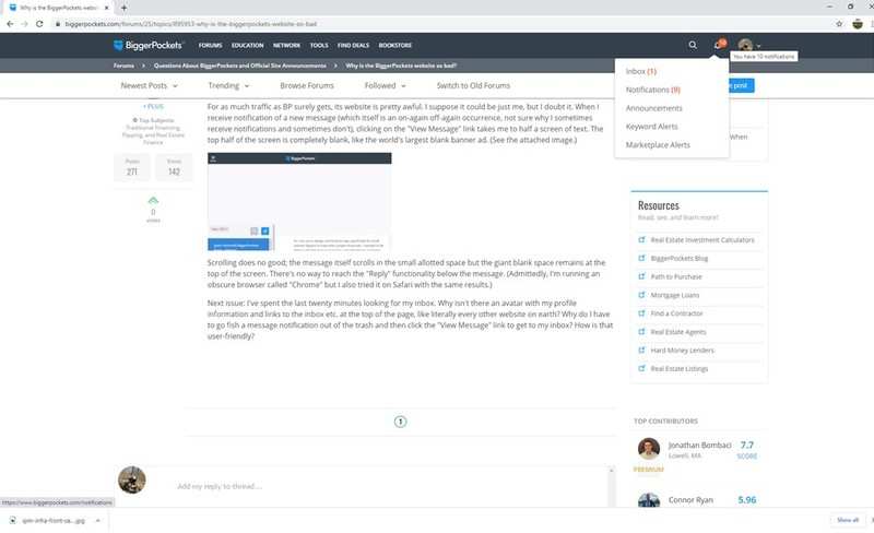
For as much traffic as BP surely gets, its website is pretty awful. I suppose it could be just me, but I doubt it. When I receive notification of a new message (which itself is an on-again off-again occurrence, not sure why I sometimes receive notifications and sometimes don't), clicking on the "View Message" link takes me to half a screen of text. The top half of the screen is completely blank, like the world's largest blank banner ad. (See the attached image.)
Scrolling does no good; the message itself scrolls in the small allotted space but the giant blank space remains at the top of the screen. There's no way to reach the "Reply" functionality below the message. (Admittedly, I'm running an obscure browser called "Chrome" but I also tried it on Safari with the same results.)
Next issue: I've spent the last twenty minutes looking for my inbox. Why isn't there an avatar with my profile information and links to the inbox etc. at the top of the page, like literally every other website on earth? Why do I have to go fish a message notification out of the trash and then click the "View Message" link to get to my inbox? How is that user-friendly?
Investor · NJ · Member since 2018 · 15 posts · 4 votes
5y
@Andrew Taylor while I have not experienced this issue, I do agree the user experience can be better. I experience daily bugs on both my mobile app and desktop ..
Rental Property Investor · Sioux Falls, SD · Member since 2015 · 9k+ posts · 18k+ votes
5y
I use Chrome on PC and have never seen an issue like you describe. There is a bell in the title bar that has quick access to your inbox. It could be something specific to Mac or the version of Chrome you are running. What version is it?
Investor · NJ · Member since 2018 · 15 posts · 4 votes
5y
@Andrew Taylor while I have not experienced this issue, I do agree the user experience can be better. I experience daily bugs on both my mobile app and desktop ..
Investor · Providence, RI · Member since 2016 · 138 posts · 40 votes
5y
I'm surprised there isn't more discussion on this, the app is finicky and the website buttons just sometimes don't work. It is very surprising for how popular the site is to have a weak framework. Great service, hate to even say it because they do a great job of content and getting people involved but I just have to at this point. The UX is terrible.
Property Manager · Janesville, WI · Member since 2017 · 707 posts · 297 votes
5y
I would agree the site could be better but the App is far far worse. App notifications never go away. It is hard to navigate. I am hoping that this platforms grows on the networking side and implements better social tools so you can actually optimize your profile.
Investor · Columbus, OH · Member since 2017 · 861 posts · 1k+ votes
5y
THANK YOU. Every time I type up a post/reply, I get insane bugs. For a while it was double-typing letters, so instead of "hello investors" it would be "hheelloo iinnvveessttoorrss" .. When I hit backspace, the cursor will skip around to a completely different part of the message and start deleting random other parts of the message. If I have an extra space or an extra newline somewhere in the message, the whole post gets stretched out like I was drunkenly abusing the enter key, and I have to go back and delete random spaces until it fixes it. And sometimes, for no reason whatsoever, it just adds bulletpoints.
And on mobile, there are parts of the website all over the place. The black bar at the top will become detached and get stuck in the middle of the screen. Why? No idea. Bells disappearing and reappearing, notifications that I can't clear, etc.
And don't get me started about the "new forums" design. Lets take an extremely valuable, high-traffic website that built up probably tens of thousands of newbies into successful investors and COMPLETELY RUIN IT. Instead of lots of conversation threads about different topics, lets make it look like twitter's mentally handicapped cousin. For people with no attention spans I guess? All those guys who paid for PRO memberships so they could have more marketing visibility for the posts they are taking the time to write, haha F them, no reason to show those in the new design, right?
The only explanation I can think of, the private equity that bought BP has some brainiac MBA somewhere with no idea about UI/UX or programming that is "improving" things, while also cheaping out on development, and nobody has any support for any sort of testing before pushing to production.
However, we do have 8 frigging stickied posts about "INVESTOR FRIENDLY REALTORS IN ANN ARBOR/WAZOO CITY/MARICOPA COUNTY"..... JFC Why...
Real Estate Broker · St. Petersburg · Member since 2015 · 12 posts · 8 votes
5y
@Nicky Reader
I have to agree with much of what has been written. The app crashes often. The fact that they don't show a Pro member's logo in the online versions of the forum is maddening as over half of BP's traffic is likely mobile, if they're like most other websites.
I think that this is a great site that could be better.
Real Estate Agent · Washington, D.C. · Member since 2012 · 17k+ posts · 30k+ votes
5y
Im a pretty big power user of the site, and I don't think Ive experienced any of the issues mentioned here. I use the site on both mobile Chrome and desktop Chrome.
Contractor · Magnolia, TX · Member since 2016 · 279 posts · 155 votes
5y
I've actually figured out how to resolve my desktop Chrome issue that was the genesis of this post. It turns out making the window wider causes the site to re-draw. I use Chrome on half of a 27" monitor, so you'd think the window would be plenty wide but apparently not.
Mobile app and other issues noted above by other users are still problems, though.
I would agree the site could be better but the App is far far worse. App notifications never go away. It is hard to navigate. I am hoping that this platforms grows on the networking side and implements better social tools so you can actually optimize your profile.
I had to delete the app. Sooo many issues, I'd rather just use chrome on my mobile to access website.
Contractor · Magnolia, TX · Member since 2016 · 279 posts · 155 votes
5y
Bugs get squashed by developers when they are pointed out. Bad design and bad user experience are left to fester until something better comes along to take its place.
I enjoy this community, and I appreciate its collective power. Most of the people in this thread have said the same thing. That doesn’t change the fact that the user experience needs to be modernized.