Good news! There are some awesome improvements to the forums that allow for an easier user experience. Keep reading for the highlights.
Easily follow discussions with a simpler design. Plus, users stats are more predominantly displayed so you can quickly identify experts.
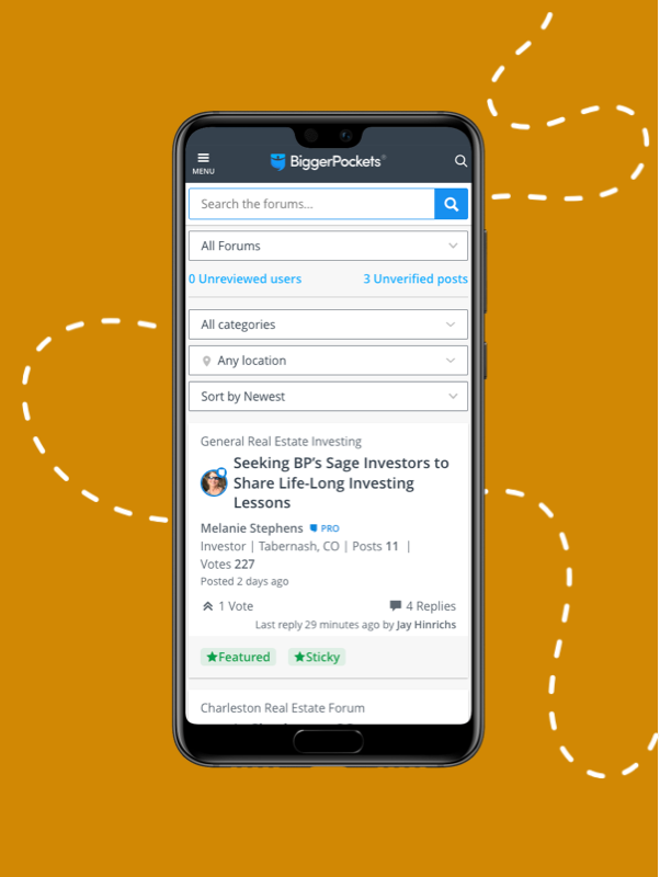
We finally optimized for mobile usability! This way you can stay involved on the go.
Note: the iPhone and Android apps have not been updated, you must visit biggerpockets.com/forums to see the improved mobile experience
Now tag your topic posts with locations that can be easily found via the location filter at the top of your forums experience. Find what you’re looking for faster.
A clean new design with all the most relevant information prominently displayed. This makes the conversation amongst BiggerPockets members that much easier to read!

So, how and where are we allowed to post our events? I only ask, because I constantly get flagged and my posts removed. Haven't logged in here in couple weeks (I usually am in here once a day or every other day, but have been busy lately). Just logged in here today for the first time in a bit and now I am even more confused than I already was.
Any help/feedback would be great
Overall, you've done a good job. I think you've received some helpful comments on this thread as well as some not so helpful ones. It's definitely a challenge to keep everyone happy while updating features according to new website code.
I think 'jump to last post' and browsing forums by topic the way it used to be were my only two disappointments.
@Alicia Marks
Overall, you've done a good job.
How is this in any way a 'good job'...? The forums have become much more unnavigable, cumbersome and less user friendly. Out of 152 comments, there were only perhaps 3 or 4 that in any way supported the changes. And the promised changes have generally yet to appear....it appears to me that the 'Powers That Be' intend to just let this mess go on and on until we all get used to it and hopefully shut up.
You are of course, entitled to your opinion, however wrong it may be - no offense intended....
I don't like having to click into the window so that I can start writing. In the old format, I'd reply and the cursor would be in the text window. Now I have to click reply and then click in the window.
I really liked the easy drop down menu so I could get quickly to the forum I wanted.
I also utilized the "trending, something and unanswered" drop down for posts. I have to click into the "forums" page and then find the unanswered buttons. I have to utilize more clicks, another page has to load, it take more time and is less intuitive.
Width is difficult to read on my monitor. I haven't used the new forums on my phone yet. I didn't prefer the old forums on my phone and used my computer most of the time when I am on BP.
I do like the reply quote in gray, as it is easy to see. I am not a fan.
Can we get a few Options from the Dev team of New Forum layout and let the community decide what option is best
im newer to the BP world but trying to figure this forum out is not user friendly
Good news! There are some awesome improvements to the forums that allow for an easier user experience. Keep reading for the highlights.
|
Easily follow discussions with a simpler design. Plus, users stats are more predominantly displayed so you can quickly identify experts.
We finally optimized for mobile usability! This way you can stay involved on the go.
Note: the iPhone and Android apps have not been updated, you must visit biggerpockets.com/forums to see the improved mobile experience
Now tag your topic posts with locations that can be easily found via the location filter at the top of your forums experience. Find what you’re looking for faster.
A clean new design with all the most relevant information prominently displayed. This makes the conversation amongst BiggerPockets members that much easier to read!

When I perform a search for a specific term, I receive a list of posts that include that, but I do not see a way to order the results. The older version of this site allowed me to order them. It makes so much sense to be able to order my results, such as by the recency of comments, the number of likes, the number of comments, or the specificity of the search.
Edit: I did another search from a different spot on the site, and it *did* have those search functions.
I am missing the dropdown menu to select the forum topic. Without the dropdown, you lost basic navigation of the platform.
@Jerryll Noorden I agree completely. I've kept trying to 'get with the program' and given this a fair shot I think.....but, like you, I just don't feel the motivation any more, it's like taking a trip with a bad road map.
Since I visit the forums mainly to offer support and advice (rather than ask questions) it is frustrating to say the least.
I also note the sound of *crickets* coming from staff over this. No replies from anyone in charge any more......
So, how and where are we allowed to post our events? I only ask, because I constantly get flagged and my posts removed. Haven't logged in here in couple weeks (I usually am in here once a day or every other day, but have been busy lately). Just logged in here today for the first time in a bit and now I am even more confused than I already was.
Any help/feedback would be great

OK I don't want to be a negative Nancy and I support improvement. I am all in for improving technology... BUT never "improve" for the sake of improvement.
This new layout is horrible to navigate posts, it is counterintuitive and believe me when I say I tried. I RFEALLY tried.. all I can say is that I have WAY less motivation to hit the forums, post in forums or be helpful in the forums.
If it aint broken, don't fix it.
(sorry)... I know some of you worked hard on it, but for me at least... its not happening!
Just my opinion... that is what you all are after yes?
I think they are looking for more specific feedback on what you don't like or what you would change. The navigation all happens at the top when you enter the forums page. You can click on "categories" and select any sub category. You can type a keyword to find your sub category. It seems pretty straight forward. The big issue people seem to have is that the drop down menu when you click FORUMS is gone. Is that what you are referring to for navigation?
@Jerryll Noorden I agree completely. I've kept trying to 'get with the program' and given this a fair shot I think.....but, like you, I just don't feel the motivation any more, it's like taking a trip with a bad road map.
Since I visit the forums mainly to offer support and advice (rather than ask questions) it is frustrating to say the least.
I also note the sound of *crickets* coming from staff over this. No replies from anyone in charge any more......
Yeah, I see this happen all the time. I doubt they will revert back to how it was. I was also spending money on ads in the forums, and the ad section as already not that great, but now.... They spend money time and resources for this "improvement" and they won't simply revert back throwing all that effort away. In time people will simply settle and say .. it is what it is, and they will proceed using BP. Me on the other hand, I don't see the point in offering value when I simply HATE being here. I mean why would I, when I don't like it?
OK I don't want to be a negative Nancy and I support improvement. I am all in for improving technology... BUT never "improve" for the sake of improvement.
This new layout is horrible to navigate posts, it is counterintuitive and believe me when I say I tried. I RFEALLY tried.. all I can say is that I have WAY less motivation to hit the forums, post in forums or be helpful in the forums.
If it aint broken, don't fix it.
(sorry)... I know some of you worked hard on it, but for me at least... its not happening!
Just my opinion... that is what you all are after yes?
I think they are looking for more specific feedback on what you don't like or what you would change. The navigation all happens at the top when you enter the forums page. You can click on "categories" and select any sub category. You can type a keyword to find your sub category. It seems pretty straight forward. The big issue people seem to have is that the drop down menu when you click FORUMS is gone. Is that what you are referring to for navigation?
Fair enough Joe.
Now here is what I pretty much HATE...
Before....
when you enter the forums, and you see the titles of each post, and you can easily and quickly navigate which post seems worth answering. I mean .. you remember!
Now this is what I see:
I have ZERO control over what I WANT to see and what I don't. I see EVERYTHING. I mean why bother only display a little bit of the post, just display FULL posts and scroll through them right? Obviously it is way more efficient and logical to just show the titles and if I like a title or topic I will click on it. But nooooo now I have to see all the completely irrelevant rants of everyone and scroll through to find a post that is actually relevant.
I honestly can NOT imagine how ANYONE will like that better than an efficient display of topic headings, clean and simple.
Not only was it frustrating that everyone absolutely doesn't give a hoot about what topics to talk about (anyone can start talking about pink elephants in skimpy bathing suits in the Marketing section, and no one would enforce this making the forums complete inefficient and pointless. Those that actually try to offer value now need to do a TON of extra work to filter through all the irrelevant posts to find actually relevant posts...
Now with this layout it is practically IMPOSSIBLE to efficiently figure out what is posted with so much "text" everywhere. You have been to my BPCON talk right? Tell the decisionmakers this... "People HATE reading text". Text is the last thing anyone wants to see. Conversions comes in the form of many things, including forum interactions. If you can concisely, quickly and with minimal effort show people what a post is about, what it says, and what it is specifically is about, and being able to skim through many posts at once you will get for more interaction (conversions). This is accomplished with the title/topic of the post.
In the world of engineering and technology I see this ALL the time. People put more value in "upgrades" rather than checking if the upgrade is worth it at all... FUNCTIONALITY. It is very obvious that applicable functionality was not the focus here. It feels like those that gave the thumbs up on this are not actually people navigating and using the forums.
A simple poll will show everyone that the sheer majority of the users do not like this new look, then why if it is not to "improve" Bigger pockets, is this change even here still (when there is more frustration because of it than there is value).
Then...
I don't see the list of the top contributors in the forums either. This is not an ego trip, this is to show credibility. You more than most people know I stand pretty much alone when it comes to marketing. While the rest of the planet advocates cold calling driving for dollars and lousy DMM, and some nobody monkey comes along and says DM<M SUCKS... NO ONE will even think about listening to me, because "who are you?!, going against the entire planet??
Well with that top contributors people see that I am credible and they SHOULD listen to me.
I don't care about anything else... The only thing I do her eon BP is answer questions and provide uncensored genuine real smart analytics based value and answers. I NEVER ask questions, never ask for help I only give! With these changes, I don't know man.. I SERIOUSLY am BESIDES MYSELF how ANYONE can look at this and say "yes this is an improvement".. I mean seriously... are you kidding me??
Also...
try to type a longer message (like I ALWAYS do) That window where you type in literally is like 10 lines long (height?). It is IMPOSSIBLE to write a decent message when you can only see a few lines at a time. Again... those that made the decision on these changes, are they ACTAULLY using the forums?! Or are they lust looking at the looks of the design and say "awesome".
As I said, I am not expecting BP to revert back to how it was, because a lot of money time and effort went into this... but seriously... this is very disappointing and as I mentioned, I tried. I really tried getting the hang of it but it only takes me seconds to say "screw this" I am out of here.
It is what it is.. al I can say I no longer enjoy the forums...
Look all you decision makers... ( not you Joe)
use your heads, be smart., you all know I hate ignorance right? OK then..
then look at the feedback and replies. Everyone HATES it. Why are you all defending your decisions and try to argue that this is good when it is SO clear pretty much no one likes it.
It is like trying to convince a child they like broccoli when they simply don't like it. You can tell them all you want about the benefits and nutrients... they don't like it period. So ask yourself this. WHY are you constantly upgrading the forums? It is definitely not to give us users "value" because we don't like it and most people made it obviously clear they don't. Then why then do you do it?
(Don't answer.. it is a rhetorical question much like trying to convince the child they like broccoli.. when they don't! Answering me trying to convince me that this IS indeed better and gives more value.... is obviously pointless right?)
@Jerryll Noorden I agree completely. I've kept trying to 'get with the program' and given this a fair shot I think.....but, like you, I just don't feel the motivation any more, it's like taking a trip with a bad road map.
Since I visit the forums mainly to offer support and advice (rather than ask questions) it is frustrating to say the least.
I also note the sound of *crickets* coming from staff over this. No replies from anyone in charge any more......
Yeah, I see this happen all the time. I doubt they will revert back to how it was. I was also spending money on ads in the forums, and the ad section as already not that great, but now.... They spend money time and resources for this "improvement" and they won't simply revert back throwing all that effort away. In time people will simply settle and say .. it is what it is, and they will proceed using BP. Me on the other hand, I don't see the point in offering value when I simply HATE being here. I mean why would I, when I don't like it?
Yeah, I'm afraid you're right. They can't go back now....they gave in once to the sensible crowd and they can't admit they were wrong twice. So we're stuck with this mess. They will eventually lose the veterans like us to better forums and vehicles to express ourselves, but they're counting on us being replaced by the new, young, hip crowd - who have no experience....
I just can't figure out why? Why take a good thing and trash it? It's always either power or money.....
Well we'll see what happens...I'd bet money their stats are down.
Still waiting on the mobile application overhaul!
Glad to see some updates to the mobile version! I recently created a shortcut to the forums on my iPhone (great new feature). Thanks for the info and the pictures! In case anyone is curious you can make an 'app' or link to the forums on the home page of your iPhone for the BP forums! https://www.macrumors.com/how-...
@Jerryll Noorden I agree completely. I've kept trying to 'get with the program' and given this a fair shot I think.....but, like you, I just don't feel the motivation any more, it's like taking a trip with a bad road map.
Since I visit the forums mainly to offer support and advice (rather than ask questions) it is frustrating to say the least.
I also note the sound of *crickets* coming from staff over this. No replies from anyone in charge any more......
Should have stayed with the old forum. How do we find our own posts on this format?
@Jerryll Noorden I agree completely. I've kept trying to 'get with the program' and given this a fair shot I think.....but, like you, I just don't feel the motivation any more, it's like taking a trip with a bad road map.
Since I visit the forums mainly to offer support and advice (rather than ask questions) it is frustrating to say the least.
I also note the sound of *crickets* coming from staff over this. No replies from anyone in charge any more......
Thanks for the response, Alicia....I'll look forward to seeing the final product. My hope is that it closely resembles the old forum..... :-)
Good news! There are some awesome improvements to the forums that allow for an easier user experience. Keep reading for the highlights.
Easily follow discussions with a simpler design. Plus, users stats are more predominantly displayed so you can quickly identify experts.
We finally optimized for mobile usability! This way you can stay involved on the go.
Note: the iPhone and Android apps have not been updated, you must visit biggerpockets.com/forums to see the improved mobile experience
Now tag your topic posts with locations that can be easily found via the location filter at the top of your forums experience. Find what you’re looking for faster.
A clean new design with all the most relevant information prominently displayed. This makes the conversation amongst BiggerPockets members that much easier to read!

Request : please take off the auto following and make it the readers decision to follow. its most annoying it clogs up our inbox's thank you.
@Jerryll Noorden I agree completely. I've kept trying to 'get with the program' and given this a fair shot I think.....but, like you, I just don't feel the motivation any more, it's like taking a trip with a bad road map.
Since I visit the forums mainly to offer support and advice (rather than ask questions) it is frustrating to say the least.
I also note the sound of *crickets* coming from staff over this. No replies from anyone in charge any more......
Let me give you a bit of constructive criticism, even though human emotions may not see this as constructive.
What BP should be doing, is create a board with the actual top users of the forums (if you all have not done so already), people that are on the frontlines of the battlefield and have them give input BEFORE any product is even started. You need smart polite good people with insight,... so don't ask me. I am just evil, and smell funny anyways.
Maybe this helps... At NASA and any other engineering position I held, we start with a a Document of Requirements. In said document you identify a problem that needs to be attended to. You establish why the problem is indeed a problem. and why it is worthy of fixing.
Now everyone on the board needs to approve this and agree to everything presented. Then when the problems are identified, you figure out why they happened. Was it lack of research? Wrong conclusions, wrong data accumulated? You figure THAT out first.
Then you develop a proposed solution, changes, fixes. Then in a team setting you try to convince EVERYONE on the board why THAT solution is proposed, WHY you think it will fix the problem, and HOW that solution will fix the problem.
Then you devise a plan of action, to tackle that solution knowing exactly what you are doing. Lastly, you simulate what that solution will do to the current system. Will that solution add other issues? Will that solution affect OTHER systems currently in place negatively? Positively?
I get that there are "crickets" because your team is now rushing to put out the fires (in silence... it would have been more productive to have announced it that your developers heard the public and are on it... it would calm the herd down a bit... but heck... I am not in charge how BP handles these sort of things..), but what I am saying is, there wouldn't be ANY of this in the first place if the team did it the "right" way (as I described above". And no, that is NOT what the team did because everything I had mentioned what was wrong with the current system should OBVIOUSLY have been foreseen before a single line of code was written. Everything I mentioned what was wrong is not an opinion, it is fact. It made your forums inefficient.
Now, here is the good part... from what happened, you all now can clearly see that there is a need to reevaluate the way projects are tackled at BP.
See this as an opportunity for improvement, so that any update, money and effort you put into a system (BPForums) gets a predicted ROI, even if that ROI simply is happier users of your forum. So now BP has a few options, right?
Keep it the way it is because money has been spent, or change (a few things) back to how they were, as there was honestly NOTHING wrong with it, and the attempt for improvement was not an improvement at all, and now spend EXTRA money time and effort to revert things back and the only thing you gained was a bunch of angry/disappointed users (and money lost).
Good luck with the fixes and I hope the next update truly will make everyone happy!
Anyways, here are the fixes I propose from my end:
1. Composing text box should have more height.
2. Forums should hold titles/topics, not full excerpts of posts
3. Start moderating the forum topics. Anyone can start Any topic in Any forum (INEFFICIENT for people that actually provide VALUE in said forums)
4. Ohhh bring back a way to put bullet points or "ordered lists" in replies (as I was trying to put this list in a bullet point list, but yup... gone (WHY?!?!, why would ANYONE remove it?!)
5. Bring back top contributors
6. Make the ads WORTHY of us paying for them. (that little tiny insignificant little space was ridiculous, for the money I was paying for it)
7. When I add a picture to my reply, the picture shrinks to a small size. Before it was OK because you can click on the picture to make it bigger... that feature is gone? (does anyone even test each change made... this is rookie product development stuff.. these are really armature mistakes ...)
@Jerryll Noorden I definitely agree that the development process is going to see great improvements through what has been learned in this current release. As I have only been on the BiggerPockets team a few months, I cannot speak to the process that occurred at the beginning of development stages for the current release, but I can say assuredly that our team is working to develop a design process that emulates much of what you described, as it is a best practice in strategic planning. Part of the goal in future developments will be to bring in users and stakeholders that understand the needs and desires of our members to help plan for the most effective and useful updates for future projects. We truly appreciate and are taking into account suggestions brought by members. Contributors are the backbone of our forum value, so what we create needs to be easy to use and easy to search as the top priorities.
This is the second time this has been changed (for the worse) in the last year.
Some of the most important users on this forum are not happy with it.
Please just return it to the old format or make this a lot easier!
@Jerryll Noorden I agree completely. I've kept trying to 'get with the program' and given this a fair shot I think.....but, like you, I just don't feel the motivation any more, it's like taking a trip with a bad road map.
Since I visit the forums mainly to offer support and advice (rather than ask questions) it is frustrating to say the least.
I also note the sound of *crickets* coming from staff over this. No replies from anyone in charge any more......
Let me give you a bit of constructive criticism, even though human emotions may not see this as constructive.
What BP should be doing, is create a board with the actual top users of the forums (if you all have not done so already), people that are on the frontlines of the battlefield and have them give input BEFORE any product is even started. You need smart polite good people with insight,... so don't ask me. I am just evil, and smell funny anyways.
Maybe this helps... At NASA and any other engineering position I held, we start with a a Document of Requirements. In said document you identify a problem that needs to be attended to. You establish why the problem is indeed a problem. and why it is worthy of fixing.
Now everyone on the board needs to approve this and agree to everything presented. Then when the problems are identified, you figure out why they happened. Was it lack of research? Wrong conclusions, wrong data accumulated? You figure THAT out first.
Then you develop a proposed solution, changes, fixes. Then in a team setting you try to convince EVERYONE on the board why THAT solution is proposed, WHY you think it will fix the problem, and HOW that solution will fix the problem.
Then you devise a plan of action, to tackle that solution knowing exactly what you are doing. Lastly, you simulate what that solution will do to the current system. Will that solution add other issues? Will that solution affect OTHER systems currently in place negatively? Positively?
I get that there are "crickets" because your team is now rushing to put out the fires (in silence... it would have been more productive to have announced it that your developers heard the public and are on it... it would calm the herd down a bit... but heck... I am not in charge how BP handles these sort of things..), but what I am saying is, there wouldn't be ANY of this in the first place if the team did it the "right" way (as I described above". And no, that is NOT what the team did because everything I had mentioned what was wrong with the current system should OBVIOUSLY have been foreseen before a single line of code was written. Everything I mentioned what was wrong is not an opinion, it is fact. It made your forums inefficient.
Now, here is the good part... from what happened, you all now can clearly see that there is a need to reevaluate the way projects are tackled at BP.
See this as an opportunity for improvement, so that any update, money and effort you put into a system (BPForums) gets a predicted ROI, even if that ROI simply is happier users of your forum. So now BP has a few options, right?
Keep it the way it is because money has been spent, or change (a few things) back to how they were, as there was honestly NOTHING wrong with it, and the attempt for improvement was not an improvement at all, and now spend EXTRA money time and effort to revert things back and the only thing you gained was a bunch of angry/disappointed users (and money lost).
Good luck with the fixes and I hope the next update truly will make everyone happy!
Anyways, here are the fixes I propose from my end:
1. Composing text box should have more height.
2. Forums should hold titles/topics, not full excerpts of posts
3. Start moderating the forum topics. Anyone can start Any topic in Any forum (INEFFICIENT for people that actually provide VALUE in said forums)
4. Ohhh bring back a way to put bullet points or "ordered lists" in replies (as I was trying to put this list in a bullet point list, but yup... gone (WHY?!?!, why would ANYONE remove it?!)
5. Bring back top contributors
6. Make the ads WORTHY of us paying for them. (that little tiny insignificant little space was ridiculous, for the money I was paying for it)
7. When I add a picture to my reply, the picture shrinks to a small size. Before it was OK because you can click on the picture to make it bigger... that feature is gone? (does anyone even test each change made... this is rookie product development stuff.. these are really armature mistakes ...)
@Jerryll Noorden They should be paying you for that kind of advice, my friend....solid stuff....
Of course anyone with a tad of business acumen would have a plan before making a huge move like this. Rather than throwing out a hand grenade and then going in to clean up the pieces...... :-)
@Alicia Marks
What @Jerryll Noorden is describing is called VOC (voice of the customer) everything he said is spot on but more importantly you should get VOC data on what to change, not only how to change it.