Fort Worth, TX · Member since 2020 · 1k+ posts · 2k+ votes
Good news! There are some awesome improvements to the forums that allow for an easier user experience. Keep reading for the highlights.
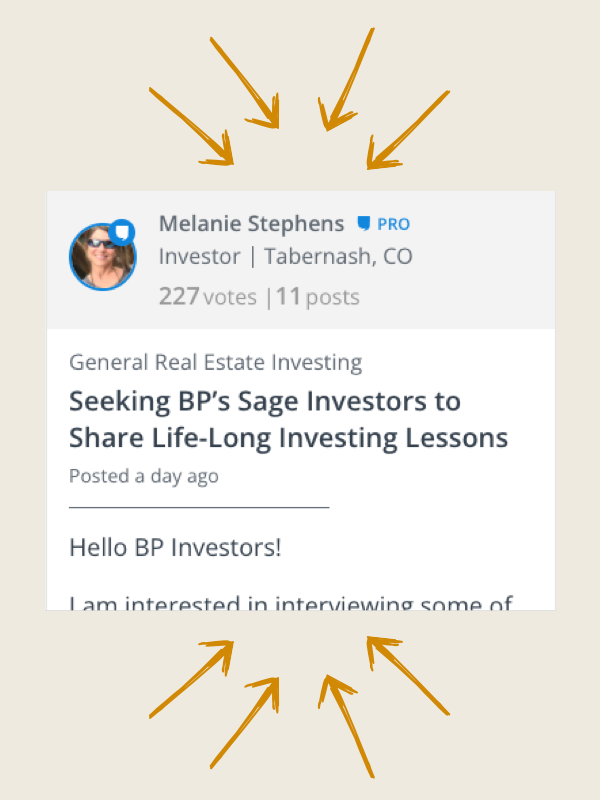
Easily follow discussions with a simpler design. Plus, users stats are more predominantly displayed so you can quickly identify experts.
We finally optimized for mobile usability! This way you can stay involved on the go.
Note: the iPhone and Android apps have not been updated, you must visit biggerpockets.com/forums to see the improved mobile experience
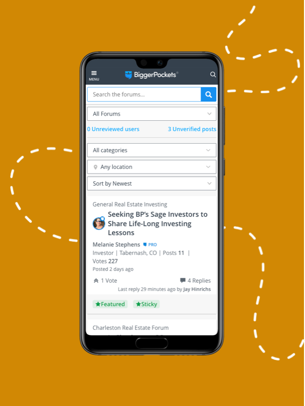
Now tag your topic posts with locations that can be easily found via the location filter at the top of your forums experience. Find what you’re looking for faster.
A clean new design with all the most relevant information prominently displayed. This makes the conversation amongst BiggerPockets members that much easier to read!

The main forums page has too much information. Only 3 posts fit on the entire screen. You have to page down constantly to find posts that interest you rather than seeing a page full of threads on one screen.
I just navigated away from this post and when I came back, my draft post was gone.
I’m not seeing the easier to use part. So full disclosure I’m not the most tech savvy person but if something takes me more than 10 minutes and I’m still having trouble. I’m done. Maybe I’ll try again in a few weeks.
I don' t know if this has been noted, but is there a way to keep the notify me box unchecked when you reply to a post? It used to be you did that once and it remembered your setting. Now it checks that box as the default every time. thanks.
Why do you want to display all the information of the original poster on the forum list. I really don't care how many posts or votes the original poster has when I am browsing for topics. I don't mind you displaying it when I open a thread, but not on when I am looking at the list of threads. You are cluttering the screen with useless information at that stage. I only want the title of the post, and I want as many of them on a single page. I hate scrolling or clicking just to read four more subject header. My eyes are much faster to browse and choose a topic of interest than my hands.
Here is my take after trying this for a day......I usually look forward to starting my day with a cup of coffee and a little time on this forum as well as others. This one has become messy and not fun to navigate. I will check in once in a while, but my daily visits are over for now.....too bad, but more time on my other forums I suppose.....
Here's my visual feedback. As @Mike S. stated I think showing all of the poster stats with the poster description, post count and vote count is very distracting and also confusing. When I see the User post count & vote count, I keep thinking that is the # of posts on this Forum post. That information seems unnecessary.
Otherwise, by just making some small visual changes I think the overall forum posts would look a more compact and easier to scroll through. In the screenshot below the overall height of each forum post has been reduced by 50%.
Generally speaking, I also think the font-sizes are too big.
Every time the forums get "easier to use" I have a harder time using them....
Austin, do you have specific usability feedback on the new forums?
Kevin I gave it some time and now I have some feedback. I am primarily a desktop user, which will make a difference.
-I click a topic and it takes me to first post every time, or most recent. Taking me to my last read post is more useful so I don't have to scroll around finding what I've already read.
-On other forums I have the ability to mouse over a topic and quickly see the first sentence or two of the first post. Here I have to click to see if its a topic I have any interest in based only on the title.
-Organization is hard to follow. The centered justification is weird and makes for cluttered post boxes.
-Possibly my biggest gripe is that there is little differentiation between poster name, payment status, title, location, and when they replied (phew!) from the main message body. I find myself reading all of this information first whether i want to or not, then the reply. This should be broken off into a specific section so it is still available but can be 'filtered out' by a reader trying to follow a topic
-Vbulletin style forums have been around forever, and continue to be a favorite amongst forum people for a reason: they're easy and intuitive. No clutter, no nonsense. All of my favorite forums are Vbulletin of some shade or another. They probably lack the ability to add the features you want, but the style and layout are classic and (in my opinion) a great template.
I'm with Evan Polaski on this one. I like the dropdown forum menus, much easier/quicker to find what I am looking for. If I can't find something of interest fairly quickly, I move on.
It is STILL missing Jump to last POST... just like last time you upgraded, please this is an essential feature!
Kind of reminds me of my days running the Garmin 430 there were all sorts of functions that were not in the manual and were hidden with 2 or 3 pull downs kind of like the secret menu at In and Out burger .. :)
We are looking for the best way to educate members on our new forum features as well.
Ugh, this happens every month or so. Can't you just stick to the old forms? They were much more intuitive and it doesn't require your users to re-learn them every few weeks...I'm not sure why the forms constantly need to be re-invented.
Hi Ryan,
That's a valid question. Our forum platform was built on coding that is no longer fully supported and lacks the ability to include great features that will make the website better to use. By updating the code, some layout and features must change, but we are also able to improve aspects that we hope will create a better experience for users going forward. We are always open to suggestions to consider in future iterations as well!
Okay, I get that. But, can't you just switch out the underlaying outdated technology and keep the existing UI? Then build upon that UI with your new features or whatever? It seems like everytime the forums change, its using a sledgehammer when you could use a well-placed screw or two. Everything changes...
I hate this new format. My biggest pet peeve is that now the main topic listings are too busy. Before you had a simplified view of all the topics. If indeed the old forum template is not supported anymore, switch to something else. There are plenty of other forums out there with a simple, clean look. I used to enjoy scrolling through the different posts/topics, not anymore. If it ain't broke, don't fix it. Just my 2 cents.
Is this why I can't create a new event under the networking button like I was able to previously? It seems the functionality does still exist but it's buried under the community events. Furthermore, when I try to create an event I'm limited to just a handful of locations in my home state (Texas). I've been using BP to coordinate and market a local investor meetup in the Fort Hood/Killeen area for over a year now and this is the first time I'm not going to be able to make an event on BP. Is this BPs way of telling me smaller markets don't matter? If I'm not in DFW, Houston, or Austin market then I'm irrelevant? This is extremely frustrating! Forgive me if this feature has simply been moved to some obscure and difficult location. However, even if it has been then shame on you BP for making it so difficult to create an event for investors to connect face to face for the purpose of networking and dialogue to achieve mutual improvement. Is it time to abandon BP as a tool to organize and take this party to Facebook?
I've left detailed feedback on how this format is essentially unusable the last three times it was attempted to be launched. I didn't really use the pro features and elected a paid membership just to support the platform. Egg on my face that those resources were used to make the platform worse.
When you click post, you can’t start typing because you have to click again in the typing area, why?
when someone votes for your post you click on the notice to see what you posted that they liked, but it just brings you to the forum thread, not your post any more.
you get way less threads per page (this has to be adjustable.)
you can’t keep scrolling down you have to keep clicking next page
after you post to a thread you have to click back and then back to get to where you were in browsing new threads instead of just being dumped there or at least given the option
PLEASE change the default to NOT FOLLOW a thread. I don’t need 100 notifications per day.
please return the “last poster” as I’ll often look at a thread because of the person commenting on it.